

Warm vs Cool
Fashion Design | Digital Desgin
Overview
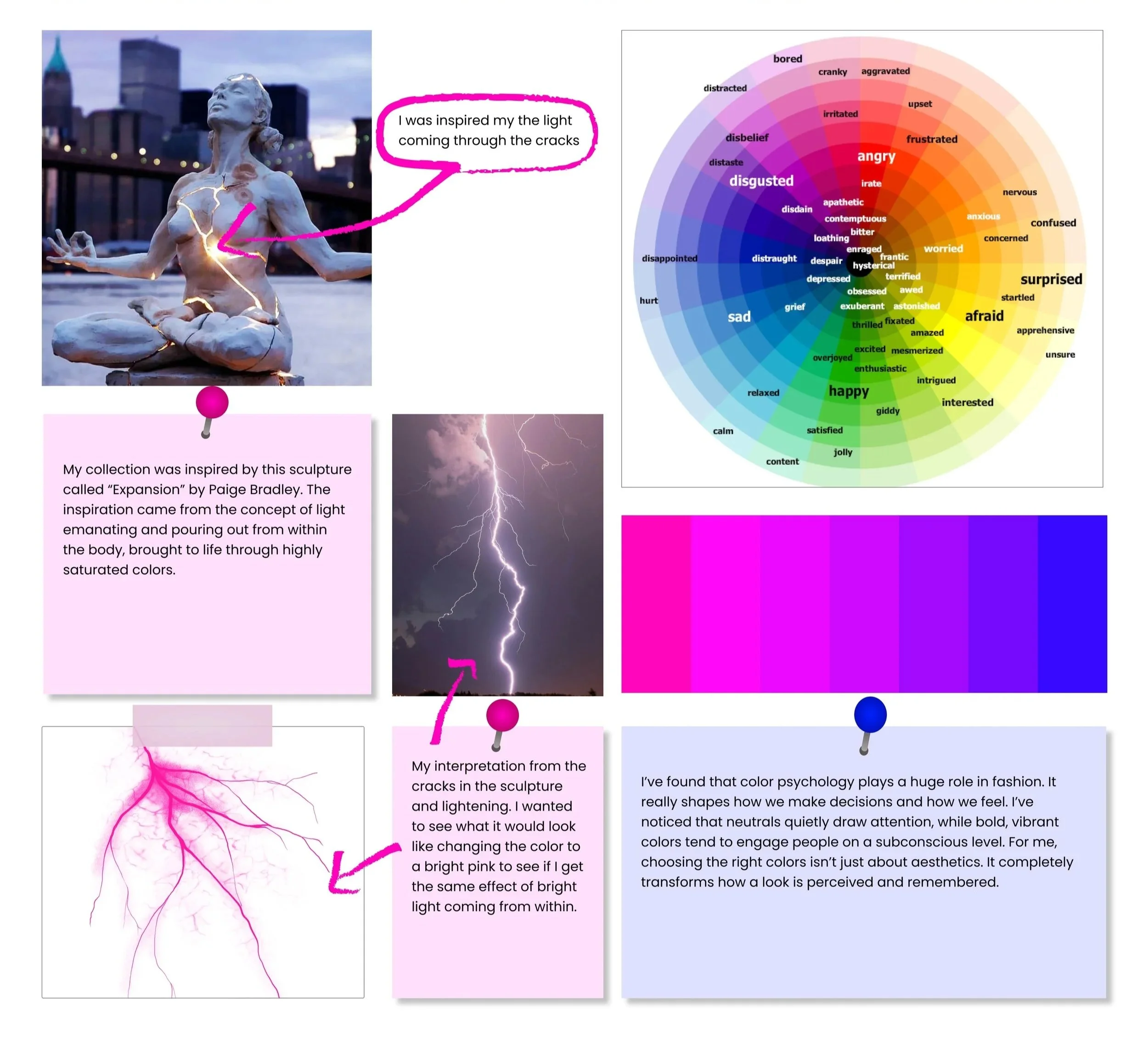
Color is more than aesthetic. It shapes how we feel, react, and connect on a subconscious level. This collection explores the psychological impact of warm and cool tones in fashion design, asking how bold pigments influence the way we perceive and process garments.
Through experimental use of highly saturated warm and cool hues, the collection studies how color placement and contrast affect the subconscious response of viewers. Do warm colors energize and capture attention more than cool tones? Does the position of color on a garment change how it’s received?
By blending fashion with psychological inquiry, this project pushes beyond style into research, uncovering how design can trigger emotional resonance through the science of color perception.
Tools
Sewing
Illustrator
Photoshop
Figma
Timeline
6 Months
Process
Ideation
Moodboard
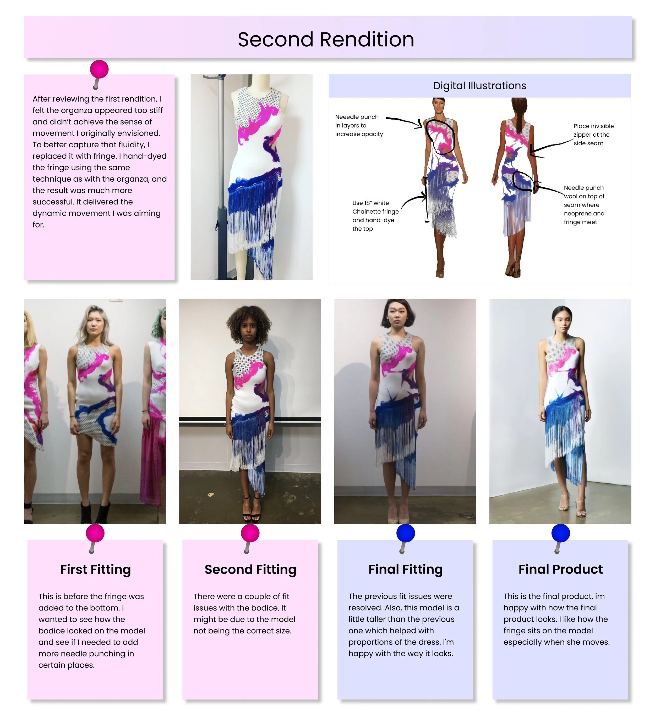
Development
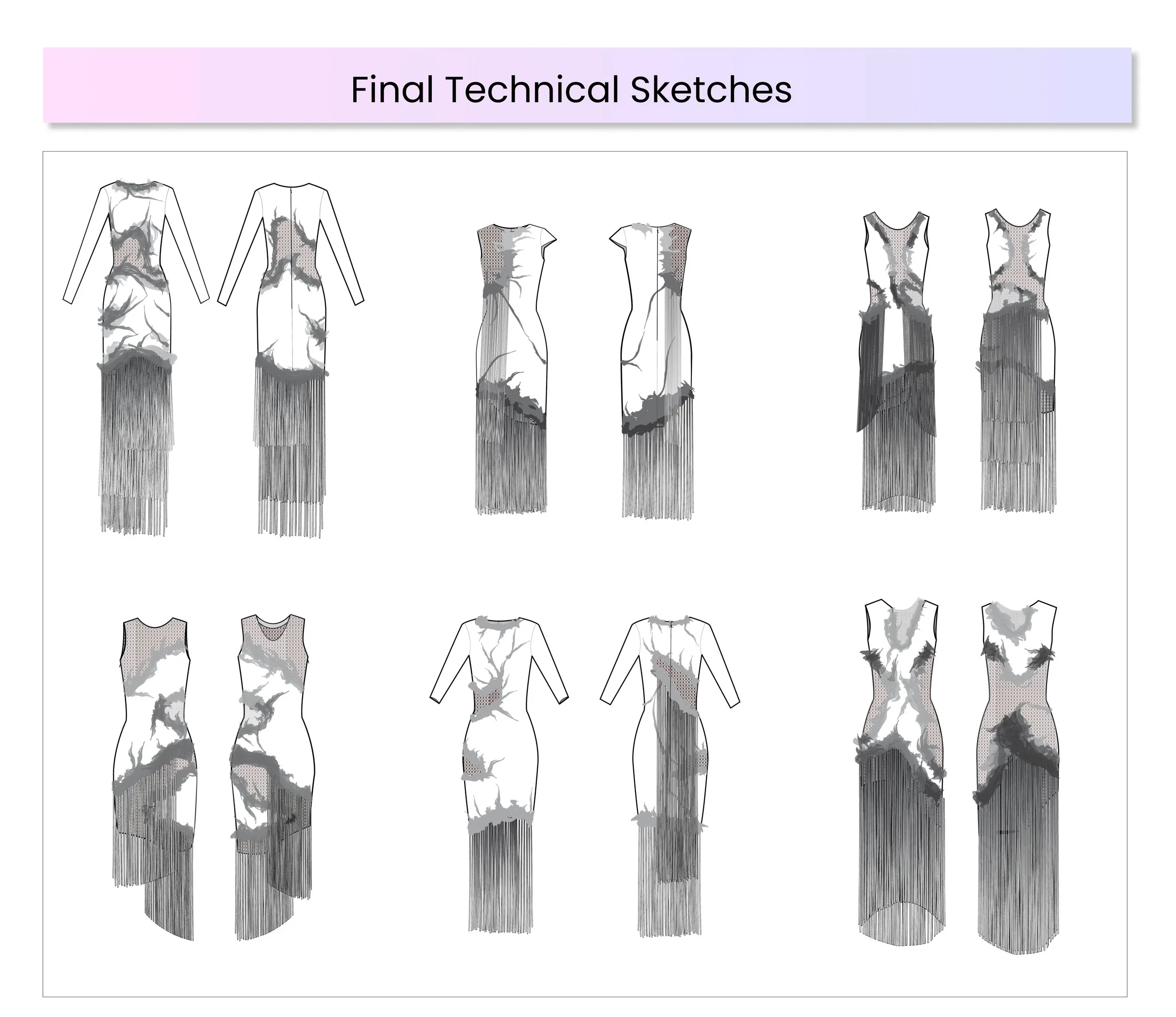
Final Collection
Fashion Show
Role
Fashion Designer
Digital Designer
Researcher
Ideation
Moodboard
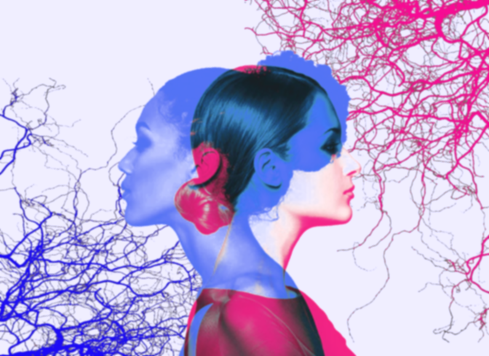
The main idea behind my moodboard was centered on how color psychology has always fascinated me; it’s incredible how blue can feel calm and introspective, while pink radiates warmth and confidence. Together, they spark a dialogue, cool versus bold, restraint versus expression. For me, this exploration wasn’t just about color harmony, but about how emotion, perception, and design intertwine to shape the story behind a look.

Development

Final Collection


Fashion Show

