Mooonstone Print
Fashion | Print Design
Overview
This print began as a watercolor experiment, loose brushstrokes, layered pigments, and moments of unpredictability that felt alive on paper. I wanted to preserve that organic energy while giving it a modern twist, so I brought the painting into Photoshop and started to play.
Through texture manipulation, contrast adjustments, and color exploration, I transformed the soft watercolor base into a vivid, multidimensional print. It became a blend of my handcrafted artistry and digital refinement, bridging the gap between spontaneity and design precision.
Tools
Illustrator
Photoshop
Watercolor Paint
Timeline
2 Weeks
Process
Print Repeat Scale
Colorways
Print On Model
Role
Print Designer
Surface Designer
Print Repeat Scale
I chose a medium 11” in x 11” in mirrored repeat scale to keep the print’s movement visible without overpowering the overall silhouette. The rhythm of the pattern allows the brushwork and layered tones to flow naturally, creating a sense of balance and harmony across the fabric.

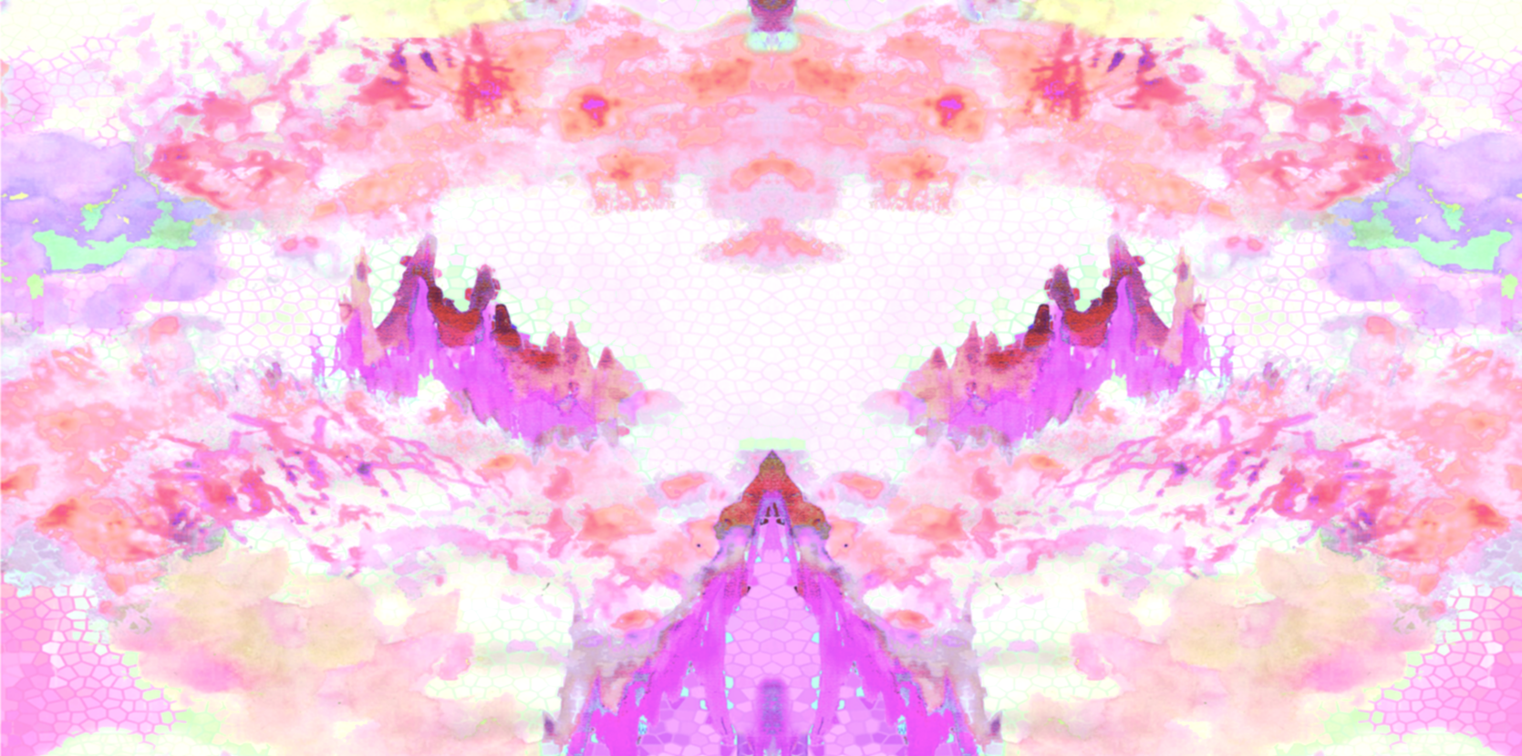
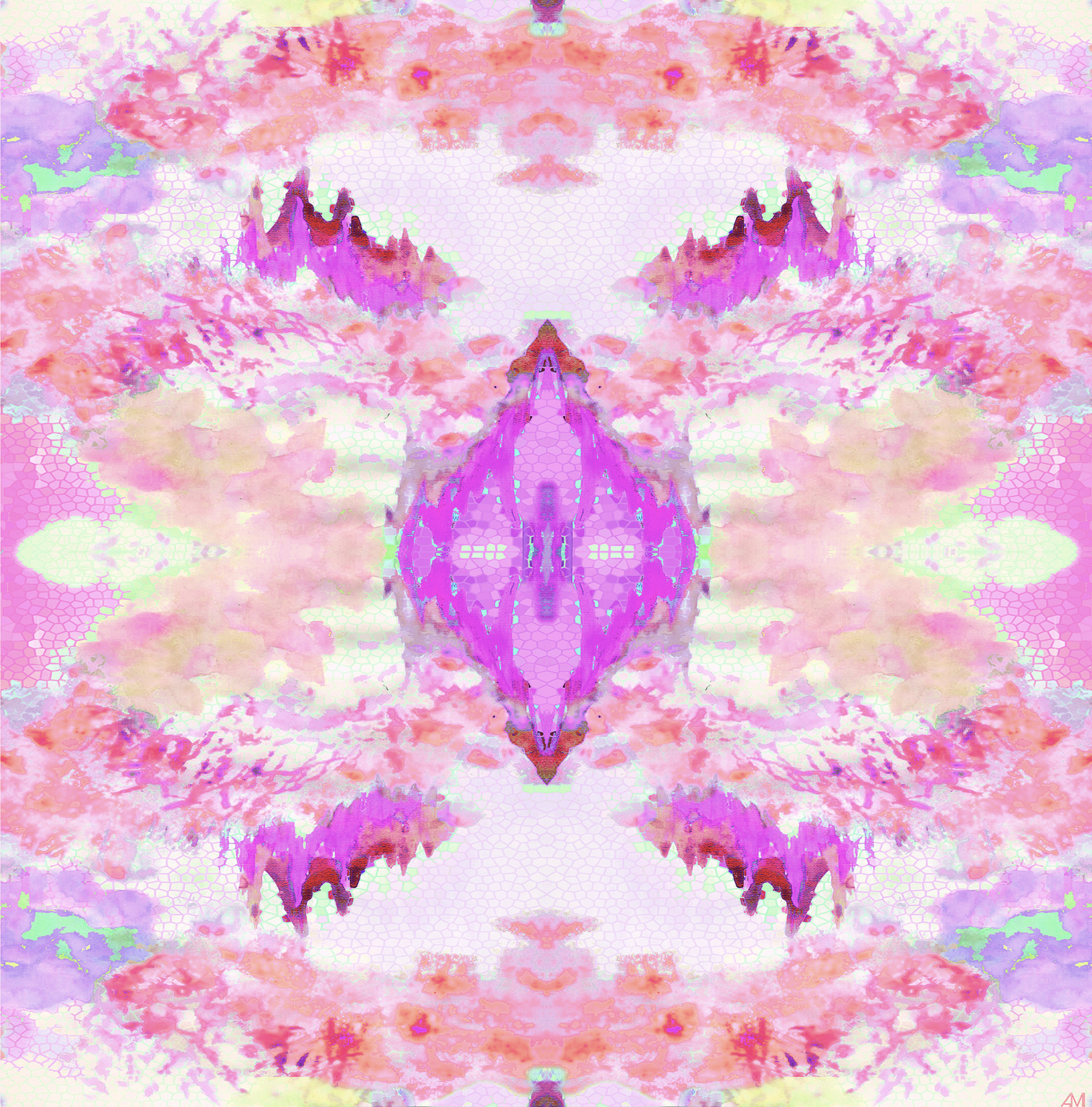
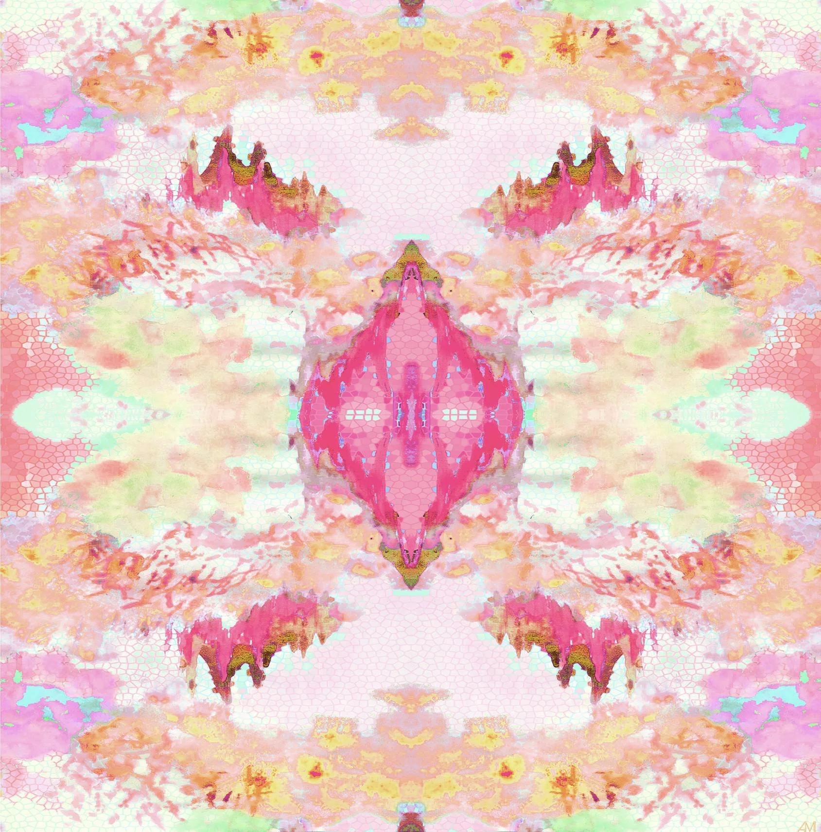
Colorways
This design evolved into four distinct colorways for Resort 2022, each one bringing out a different personality of the print. Each palette tells its own story, showing how color can completely shift the mood of a design.
Here are the colorways:
Fuchsia – playful, feminine, and full of energy
Coral – warm, sun-kissed, and effortlessly modern
Iris – cool and refined with an artistic undertone
Lime – fresh, daring, and electric
Fuchsia
Coral

Iris

Lime
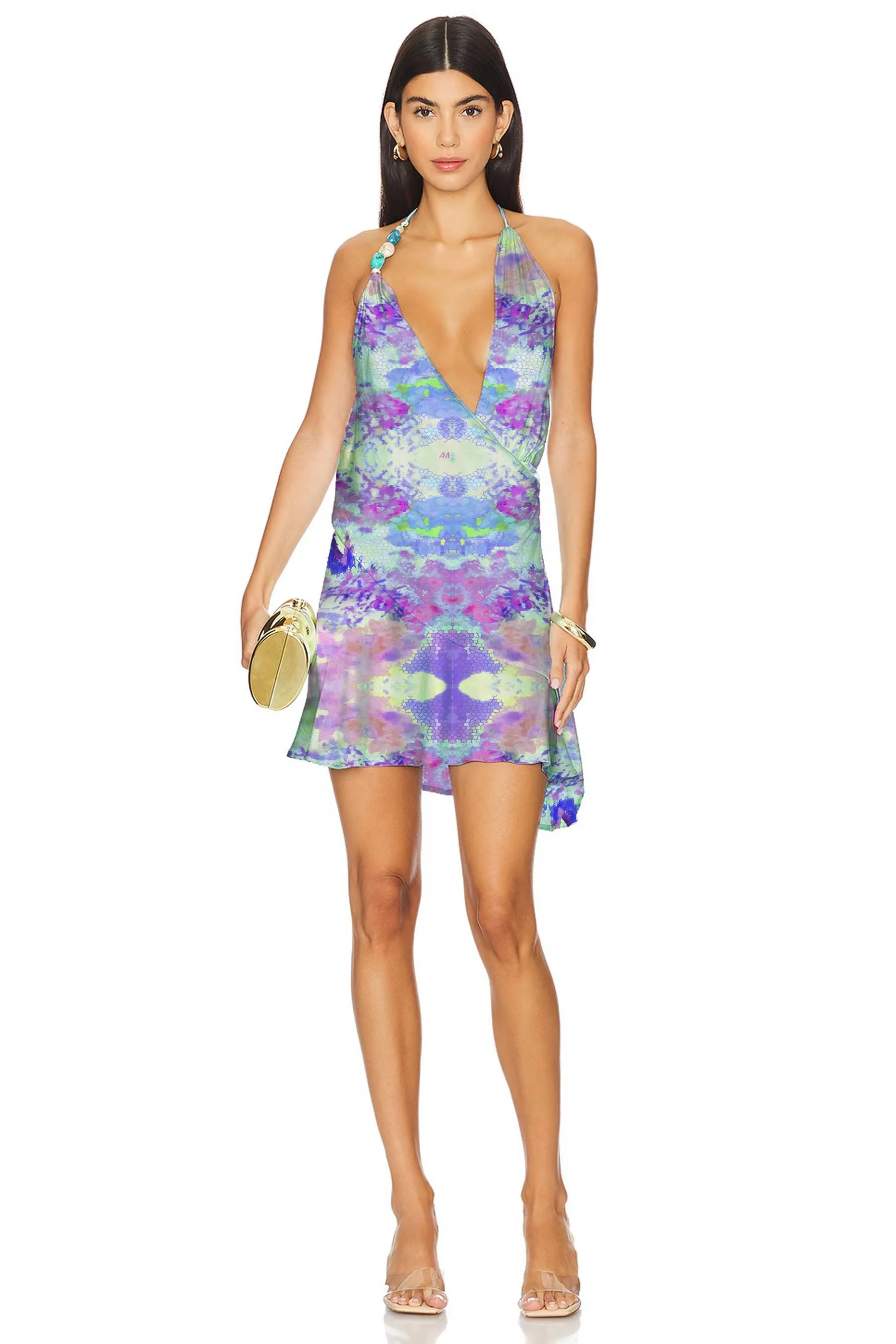
Print on Model
To bring the print to life, I styled it on four models, each wearing a different colorway. Seeing the design in motion, the way it drapes, catches light, and interacts with fabric, adds another layer to the story. It’s where the art becomes wearable, and each look reveals a new dimension of the print’s texture and personality.
Here are some examples of what the print would look like on a model.